Bringing Velodrom.cc’s brand to life through email design and visuals
Project:
Email redesign concept
Deliverables:
UI, UX
Platforms:
Figma
Transforming Velodrom.cc’s email design
Velodrom.cc is a cycling brand known for its stylish products and well-designed physical stores. Their apparel and in-store experience all reflect a modern cycling lifestyle. However, this strong visual identity isn’t fully carried over into their digital presence — especially on email.
The Challenge
Velodrom’s current emails are mostly long paragraphs of text with very few visuals or photography. Even though their products and stores look great, their emails don’t show that lifestyle, texture, or attention to design.
Heavy text, light visuals
Minimal use of photography or lifestyle imagery
Multiple topics in one email, instead of one strong story or product focus
The Concept
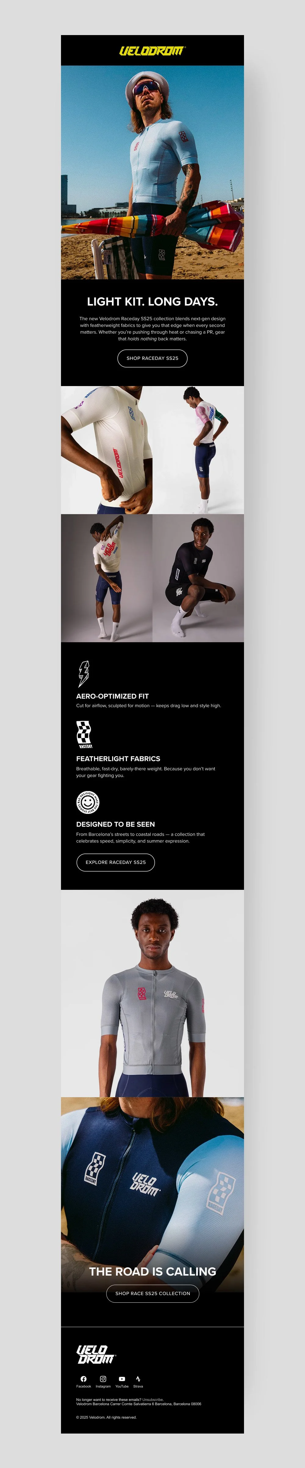
This email design concept focuses on one of Velodrom’s summer cycling kit collections. Instead of packing multiple announcements, the idea was to tell one clear visual story.
Design decisions:
Highlight only one seasonal collection
Use large product and lifestyle photography to show texture, fit, and movement
Keep copy short — focus on key features, not long paragraphs
Make each section feel connected, like a visual flow rather than separate blocks
This approach helps bring their physical brand experience into digital form, creating an email that feels premium, visual, and aligned with the way their products are designed.