Refining Graza’s email design with clean structure and brand harmony
Project:
Email design test
Deliverables:
UI, UX
Platforms:
Figma
Keeping it zesty: a clean, on-brand email for Graza
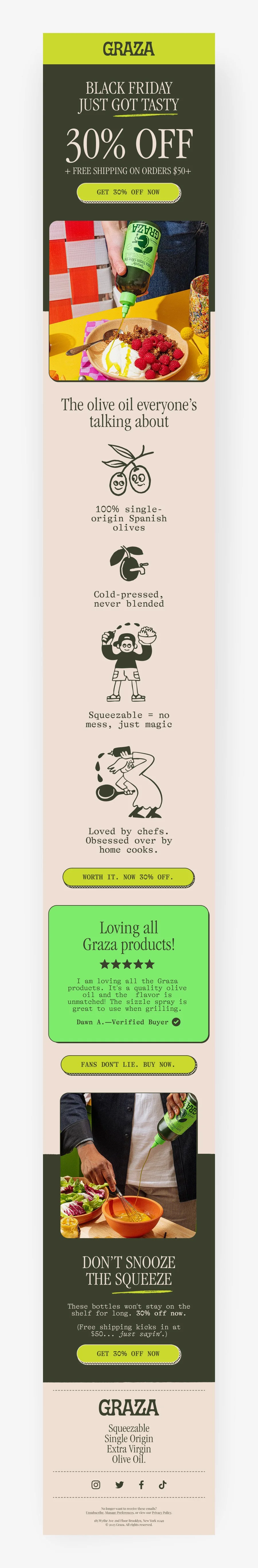
This test was part of an application for an email designer role at an email marketing agency. The assignment required designing a promotional Black Friday email using Graza’s existing brand guidelines—including their signature color palette, type hierarchy, playful tone, and bold visual aesthetic. The goal was to communicate a special offer while showcasing why customers love Graza. The design was created in Figma and delivered as a completed working file.
My approach:
Straight to the point: Focused on making the promo offer clear and easy to spot.
On-brand voice: Used Graza’s playful, punchy tone throughout the email.
Visual consistency: Matched the brand’s look by pulling assets and styles from their site and existing emails.
Clean benefits: Highlighted key product perks with minimal clutter.
Results & Takeaways
While this was a speculative test, the final email reflects an understanding of:
Brand adaptation: maintaining tone and visual consistency
Conversion-oriented design: strong CTAs and benefit-led structure
Marketing goals: increase engagement with a timely promo while reinforcing brand love
This test showcased my ability to quickly align with a brand’s identity and build a design that’s ready for the inbox.
