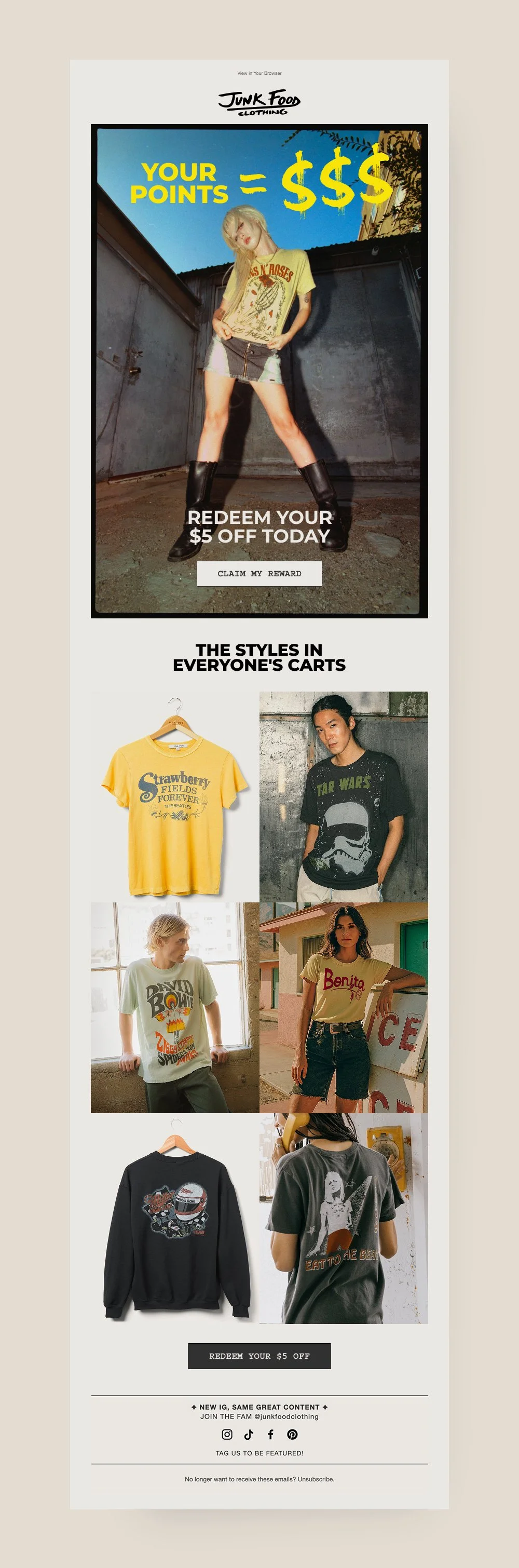
Bringing retro energy to Junk Food Clothing rewards emails
Agency:
Cart.com
Deliverables:
UI, UX
Platforms:
Figma
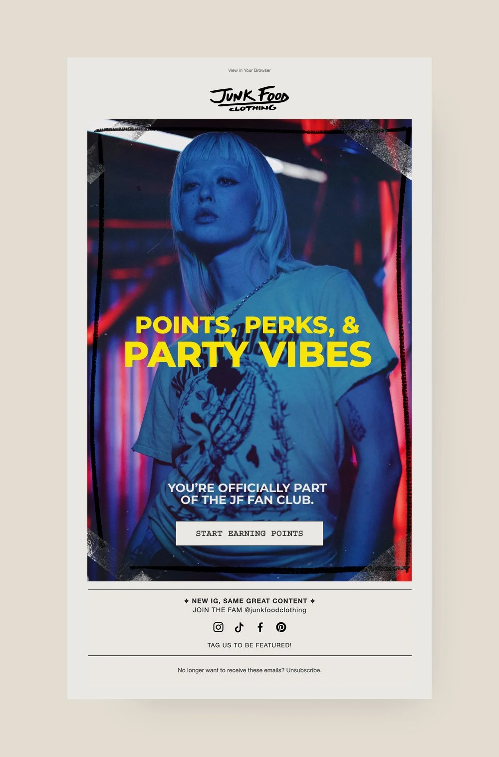
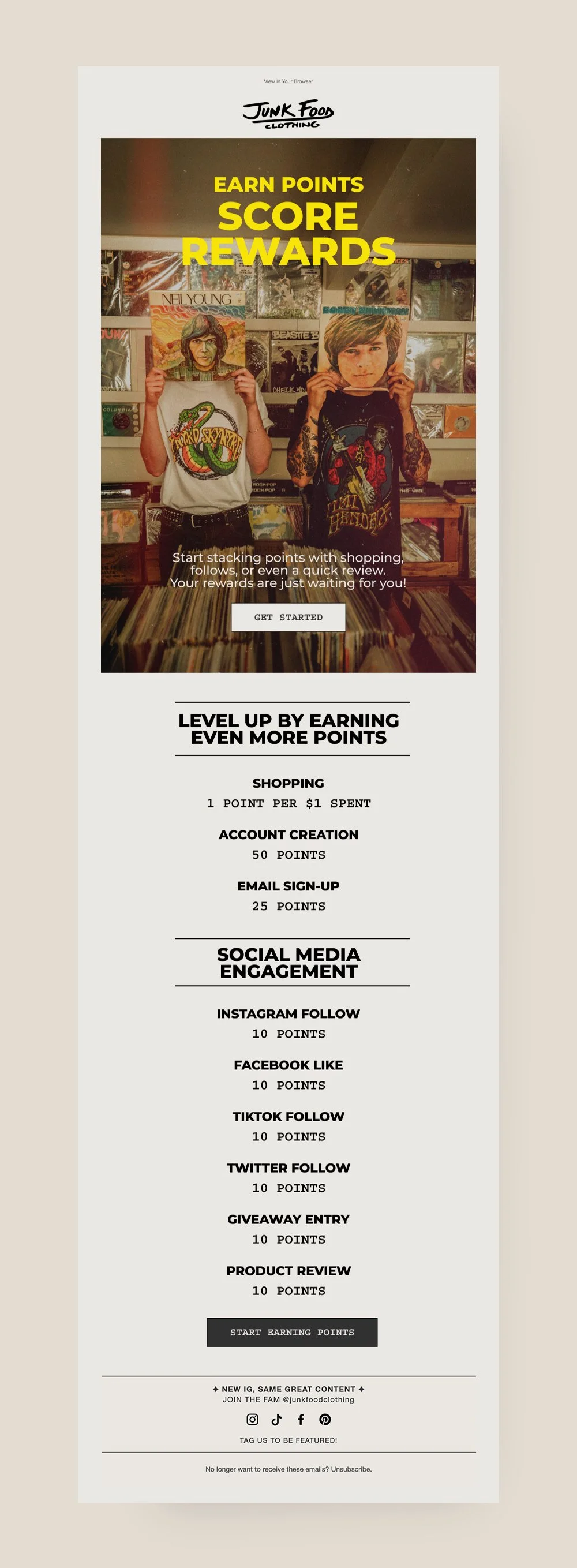
Junk Food Clothing rewards email design
Junk Food Clothing is a lifestyle brand rooted in vintage Americana and SoCal cool. Their tees carry nostalgic graphics, retro color palettes, and that laid-back attitude you'd expect from a brand named Junk Food.
The Approach:
To stay true to the brand's identity, I layered retro textures directly onto the provided photography — film grain, dust, light leaks, and halation effects that made each shot feel developed rather than digital. Tape strips, marker linework, and hand-drawn annotations gave the emails a scrapbook, zine-like quality.
For the rewards series emails, my focus was on:
Breaking down the points system into simple, scannable visual steps
Keeping the messaging punchy and casual through collaboration with a copywriter
Using texture and layering to match Junk Food's vintage aesthetic
Designing the series as a cohesive set where each email feels like part of the same story
The tone stayed approachable and playful — never corporate, always on-brand.
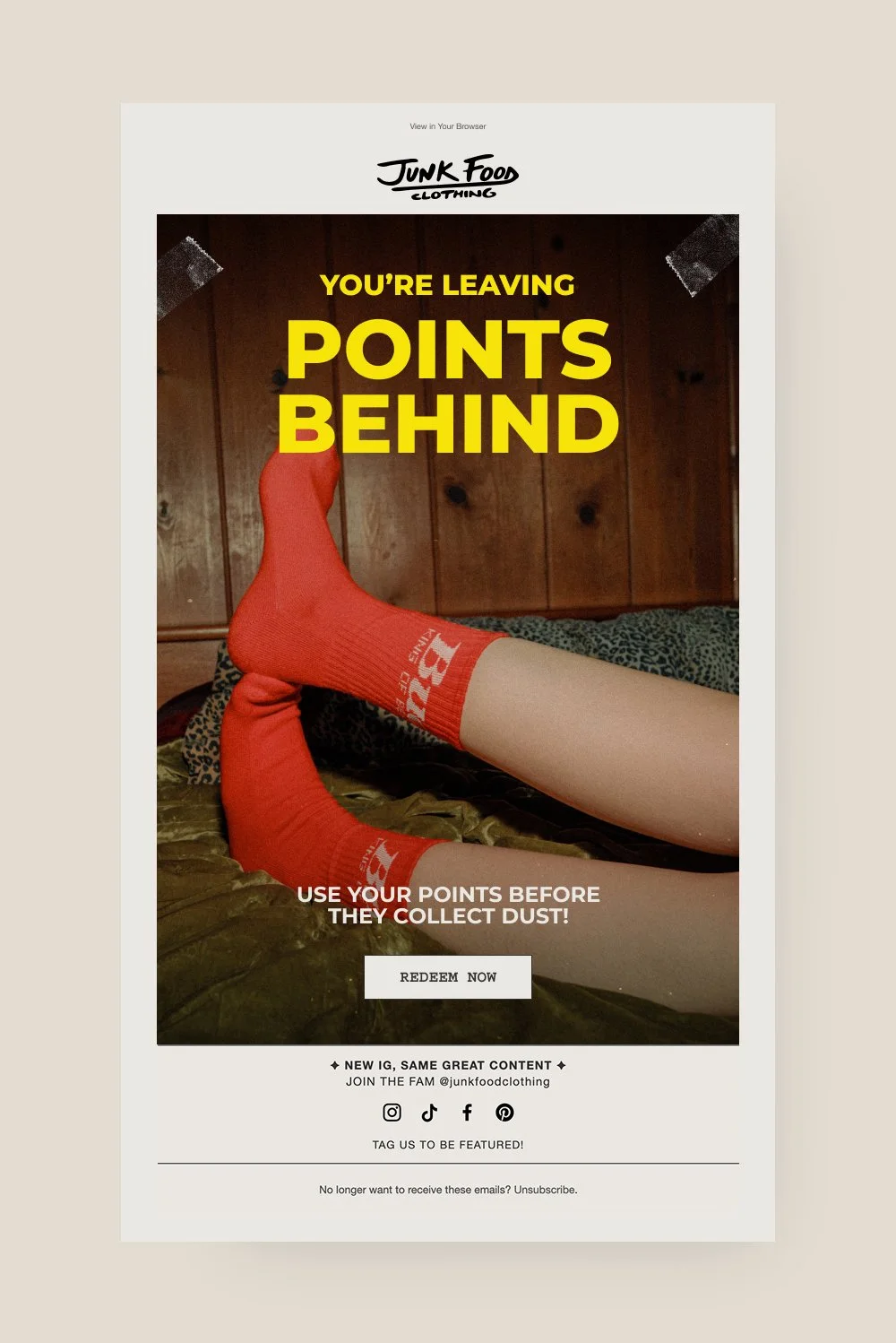
The outcome
The final design brings the Junk Food Clothing brand to life in email form — retro, tactile, and full of character.
The layout highlights the photography and rewards journey while keeping everything visually consistent with the brand's identity. Partnering with Cart.com, the series helped simplify how customers understand and engage with the loyalty program — resulting in a collection of emails that feel collectible rather than transactional.
Tools used:
Figma for layout design, texture application, photo treatment, and component organization.